Looking for One and Buying Ten!
Make Your Store Top Shopping Destination
Take a good look at how people shop at your store. Most customers come in looking for a product they need and then stumble across other products they like or need. If you’re a beauty supply store with thousands of items, you’ve probably got a lot of things to raise your customers’ desire for beauty goodies. How you capitalize on this can be the difference between making profit and loss.
So, is your store a place where your customers are eager to shop? BNB presents a guide to store optimization based on an analysis of customer shopping patterns and survey of beauty supply retailers.
1. Longer shopping times mean more sales
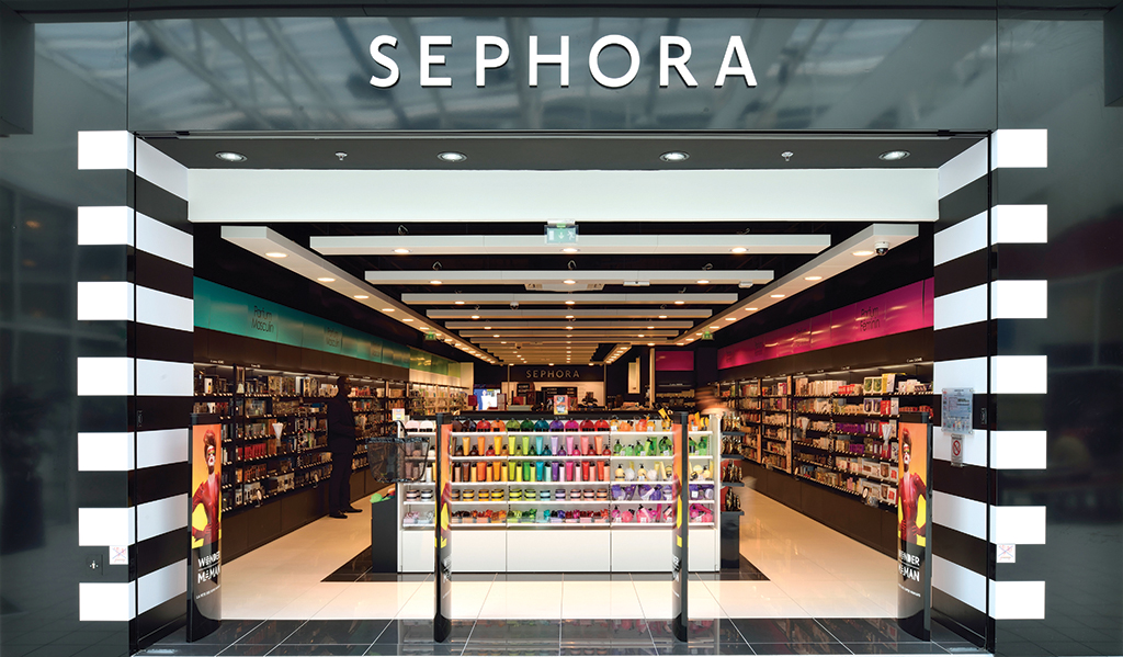
Displays in big box stores and department stores are “ever-changing”. New items are constantly coming in, the order of displays and shelf positions change from time to time, corner displays change, new corners or new brand sections open, and the overall atmosphere changes with the seasons. The large retailers typically have dedicated teams of experts who are constantly studying customer behavior and spending patterns, and using these findings to develop a way they display their merchandise in-store in an effort to open up the wallets of recession-hardened shoppers. In other words, their displays aren’t simply based on categories; they’re the result of careful planning of which items go where along the shopping pathways.
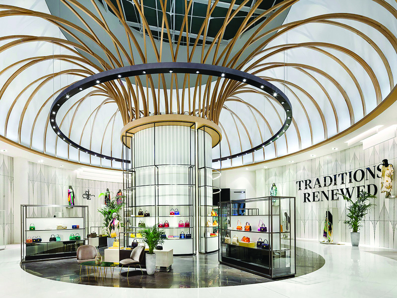
©Design Curial
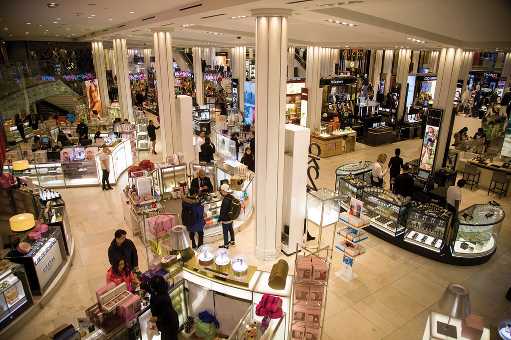
©Wall Street Journal
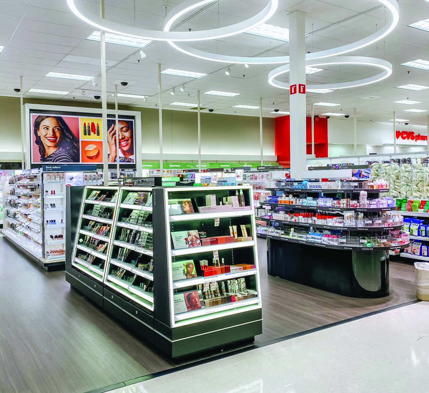
©All Thing Target
Of course, beauty supply stores can’t run their stores the same way. It’s likely too expensive or labor intensive. According to a display contractor, most beauty supply retailers stick with the store displays they initially put in place. If you change the shelves, you have to change the item organization and re-do the whole display, which is a hassle, so you’re simply stuck in a rut.
However, if your store has had the same look for years, it’s unlikely to inspire additional purchases. Granted, it may give your regulars the comfort of a familiar space. But it’s also unlikely to bring in new customers. The beauty industry is so trend-driven that if you stop changing, you stop growing. Instead of blaming the recession and the shrinking customer base, you need to reinvent yourself. So what should we change, and how?
The standard for change is simple. It’s about making it “a place where people want to shop”. In any retail store, especially a beauty supply, there are few customers who come in to buy a single product and leave with only what they need. Most of the time, they end up adding more items that they hadn’t planned on buying in their cart as they browse the store while looking for items that they might need or want. These add-ons and impulse buys should be the focal point of your strategy.
If a customer walks around the store and physically sees and touches every product before making a purchase, it would take quite a bit of time. That’s why shopping time is such an important factor today in a buyer’s decision to make a purchase. Research shows that the average supermarket shopper spends 25 minutes shopping. The average shopping time at a big box store like Walmart is 30 minutes. In our phone interview, beauty supplies reported an average 10-20 minutes which were shorter than the most retail.
Notably, there is a meaningful difference in shopping time between buyers and non-buyers. In an electronics store, average non-buyers spend 5 minutes and 6 seconds and buyers 9 minutes and 29 seconds, while in a toy store, non-buyers spend 10 minutes and buyers spend 17 minutes, according to a study by consulting firm Envirosell. In some stores, buyers stayed in the store three to four times longer than non-buyers. When it comes to beauty supplies, the average shopping time is 10 to 20 minutes, but wig customers typically stay for anywhere from 30 minutes to more than an hour. It should be obvious that the longer a customer stays in your store, or the longer they shop, the higher the conversion rate* for that customer to become a buyer.
*Conversion rate: the percentage of shoppers who eventually make purchases. Things like marketing, advertising, promotions, and store location can attract shoppers into the store. But the ultimate job of converting those shoppers into buyers is for your products, employees, and retail floor. The conversion rate is a direct consequence of what is transpired in-store.
Is my store a place where people want to linger and shop? BNB conducted a survey to find out how beauty supply retailers are utilizing their store space. More than 40 retailers participated in the survey, which included the following questions. You can utilize it for a self-check and start making some serious improvements.
Survey questions: how beauty supply retailers are utilizing space
①Center ②Left ③Right ④Inside the store
①Eye level ②Shoulder level ③Breast level ④Navel level
①Back ②Center ③Front ④Side
①Yes ②No If yes, where do you put your shopping cart or basket? ★Choose all that apply ①Next to the entrance ②Next to the aisles ③In the middle or back of the store
①Popular Products ②New Products ③Recommended Products ④Other (Specify: )
①One or two people ②Two or three people
①Less than 10 minutes ②10-20 minutes ③More than 30 minutes
①Yes ②No If yes, what did you display? ★Choose all that apply ①Accessories, jewelry, and other miscellaneous goods ②Small chemicals ③Screens ④Product poster or promotional flyers ⑤Other (Specify: ) |
2. Guide to make your store inspire shoppers
Let’s find out how to keep customers in the store longer and how to create a delightful shopping experience to drive add-on purchases and impulse buys.
There are a few key points that make a difference. From the store entrance, to the pathways, aisles, end caps, and checkout zones, each one should be strategically designed around the customer, not the staff. Advertisement placement, shelf height, cart positioning, test corners, and so on all influence how customers shop. It may seem trivial, but it can be the difference between keeping a customer in your store and having them leave in a hurry.
Let’s take a look at your store in each of the following zones and make changes where applicable. If you know what drives your customers’ desire to shop and strategically improve your store’s experience, you’ll see a difference in your sales.
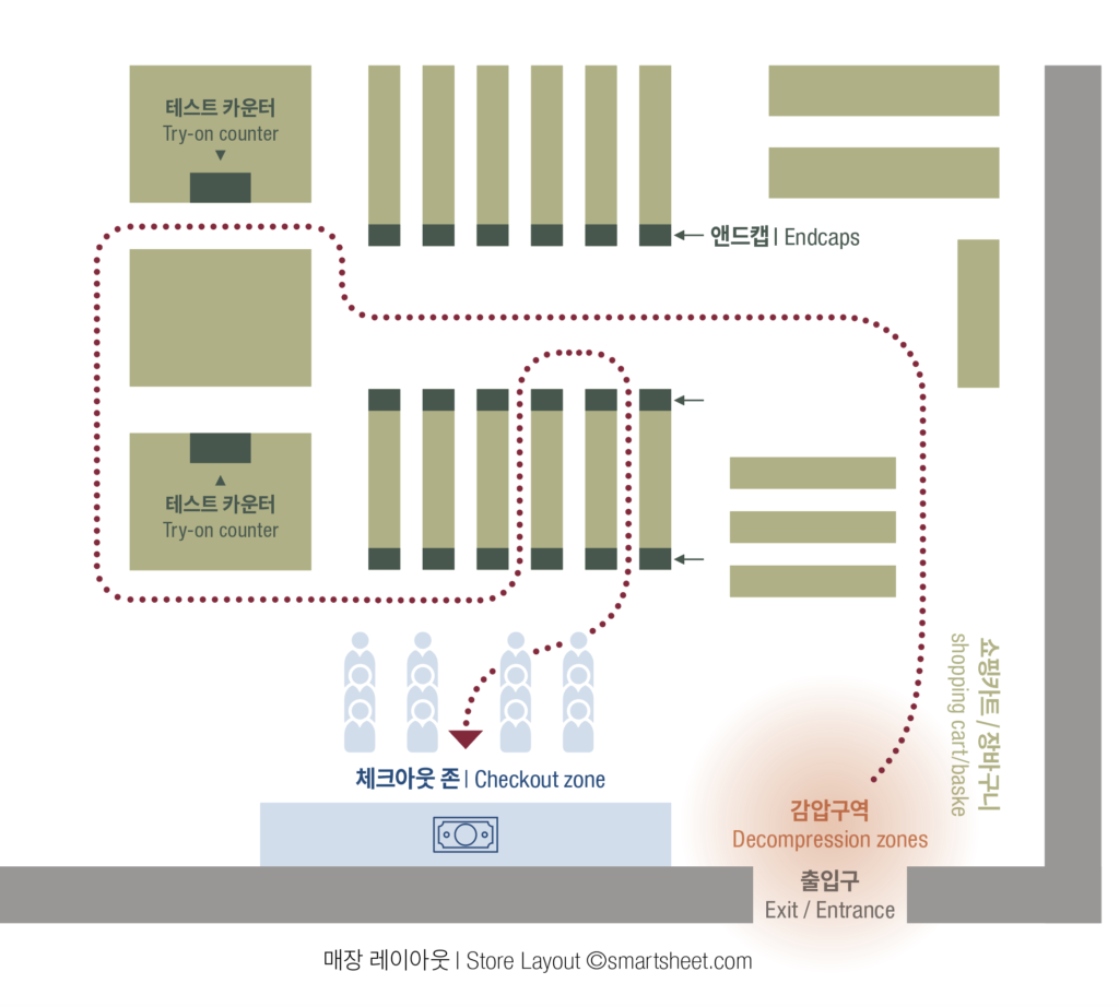
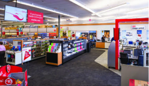
Store Layout ©smartsheet.com
✔ Entrance: give customers room to breathe
Many retailers place sale and event signs, flyers, and shopping carts right next to the entrance. This is to help a customer who walks into your store grab helpful information for shopping, push their cart, and start shopping. Unfortunately, this attempt is likely to fail.
The store entrance is a “decompression zone”, a place where customers make the mental transition from the outside environment to the shopping. As customers enter the store, they slowly adjust to the retail atmosphere, slowing their pace and noticing things, but nothing really catches their attention until they cross the decompression zone. That goes the fate of the stack of flyers or shopping baskets right by the door. The decompression zone at the entrance should be kept simple and clear of any visual obstacles.
-
- ©ixd.prattsi.org
-

- ©lga-partners.com
✔︎ Shopping carts: free your customers’ hands
Customers only have two hands. But this simple fact is often overlooked by retail business owners. Most customers come in with one or two items in mind and end up picking up more. As a result, it’s not uncommon to see customers walking around the store without a cart, scrambling to grab three or four items in an aisle or checkout line.
The solution to the “lack of hands problem” is a shopping cart or shopping basket. We found that almost all beauty supply stores have some form of shopping equipment such as a shopping cart or basket. (Only 15% had a cart, and most used the basket alone). The real issue was the storage location. More than 90% said they placed them by the entrance, which, as mentioned earlier, is a decompression zone, making it easy for customers who are just entering the store to walk right past them. Find the right solutions for your store.
‣ Employees offer a shopping cart/basket in person as customers enter the store.
‣ Move the shopping carts and baskets that are right next to the door about 3 meters inside.
‣ If a customer is seen carrying more than three items in the store, an associate immediately hands them a basket.
‣ Place extra baskets in the middle aisles throughout the store. (For beauty supplies, the basket material should be a cloth or nylon shopping bag, which is lighter and easy to handle than plastic.)
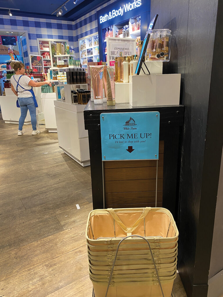
A store placed baskets and shopping bags in the middle of the store
Don’t underestimate the importance of the hand issue in shopping. Customers can’t buy more unless they have a free hand, and they are not likely to make a purchase unless they have the experience of touching and feeling items. Remember that enabling your customers to use their hands freely will ultimately determine how much money they spend.
✔︎ Customer flows: lead customers to every aisle
People will navigate your store more thoroughly if the shopping flow is smooth and there are no obstacles or blind spots. Conversely, if the flow design is poor and there are problems with the layout, you’ll have a space that most people miss. There are rules of shopping flows.
‣ Retail floor is often designed to induce counterclockwise flow, as most people are right-handed. Customers will then naturally pick up more items (with your right hand).
‣ People tend to move to the right, so promotional displays or store signature items that will be shown to customers are best placed to the right-hand side of the store entrance, just beyond the decompression zone.
‣ Customers typically travel an aisle in search of one or two products, and when they find what they were looking for, they stop and turn around. To generate additional sales, consider placing your most popular products in the middle of the aisle.
‣ Place the essentials in the blind spots in the back of the store. Like the milk aisle in a supermarket or the pharmacy in a big box store, you can make shoppers go through the rest of the store to get their essentials.
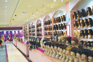
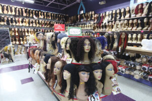
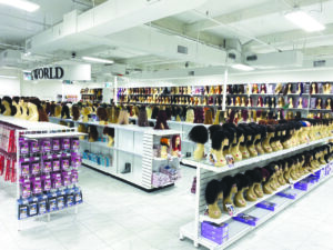
* What are the essentials for beauty supplies?66% of the retail businesses said they placed their wig section in the back of the store, and 32% on the side of the store (specifically on the right). This is where you’d want to place essentials or your store’s signature products in consideration of the typical shopping flow. Although the hair market is weaker than before, we can assume that wigs are still the main product of a beauty supply. |
✔︎ Passage: people avoid bumping into each other
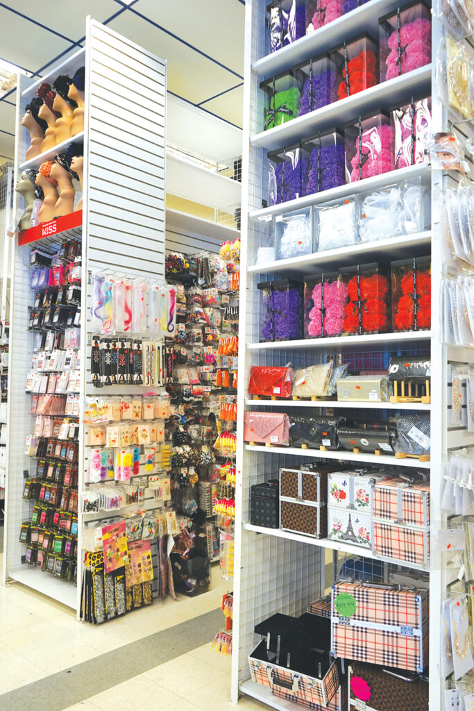
Typical aisles of the beauty supplies are not only narrow but also often packed with items. This is to stock and display more products. However, the more cramped the aisle space, the less time customers spend in that spot.
It’s no secret that Americans are sensitive about their personal space. In addition, crowded aisles often result in uncomfortable situations, triggering the butt-brush effect*.
*the butt-brush effect: when customers on opposite sides of the aisle bump into each other with their backs turned due to lack of space, they would lose interest in buying a product in such a situation.
.
When asked, “How many people can you fit ‘side by side’ in an aisle?” beauty supply retailers were equally likely to say “one or two” and “two or three”. In fact, just a few years ago, when I was surveying retail floors, I saw aisles that could barely fit one or two (slim) people. The newer beauty supply stores and remodeled stores have definitely made the aisles wider, often enough for shopping carts to maneuver. The retailers said, “Customers definitely like the big space,” but the downside is the concerns about kids running around and getting hurt.
Wide aisles are a key element of good store planning. The recommended aisle width is at least 3.5 feet so that strollers and wheelchairs can fit comfortably and customers can look for items on both sides without feeling cramped. You should also allow extra space for traffic to pass in both directions. The Americans with Disabilities Act (ADA) requires aisles to be at least 3 feet wide.
✔︎ End Caps: where the customer’s eyes meet first
The term “endcap” comes from the fact that it’s attached to the end and sticks out like a cap. Humans have a habit of looking ahead as they walk. Therefore, end caps that display products at different angles at the end of a shelf unit can be very effective in attracting customers’ attention. When you’re walking down the aisle facing the front of the store, the endcap display is the first thing that catches your eye.
How are end caps being utilized in beauty supplies? While there were a few stores that didn’t use them due to the space limitation or lack of staffing, most retailers were actively utilizing end caps. When it comes to the products they display in their end caps, 48% of respondents said they place popular products (“products that sell well”), followed by others (28%), new products (17%), and featured products (4%). Some retailers who opted for “others” went on to share their tricks with BNB readers. In addition to the creative ideas like, “I display popular products in the front end caps and stock at the far end”, “I display expensive chemicals and essentials to prevent shoplifting”, “I display eyebrows and scarves in the front for visual effect and chemicals in the back,” there were specific items they mentioned including, expensive human hair, women’s dresses and shoes, cosmetics like lipstick, oils, hair colors, edge controls, stockings, and durexes.
End Caps can tell a lot about a store
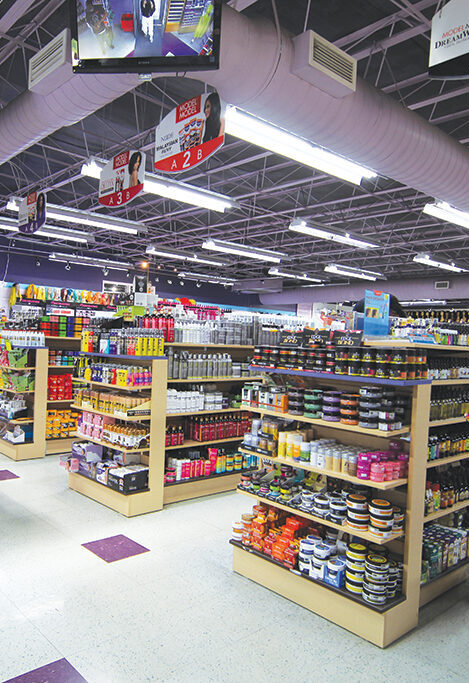
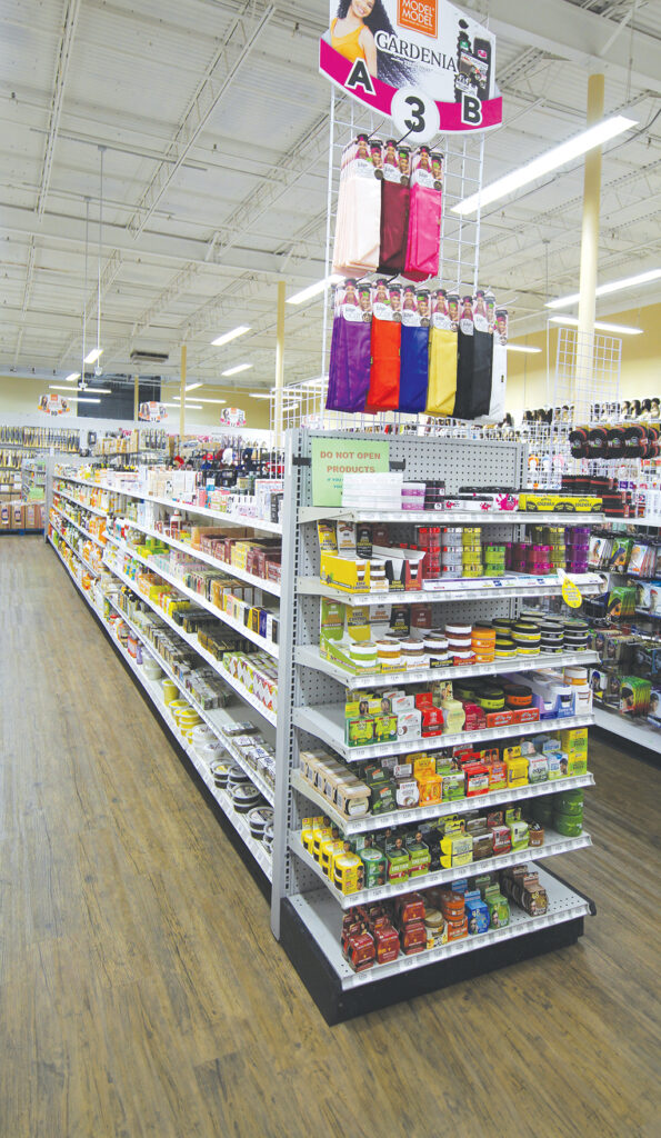
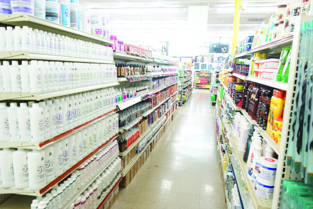
✔︎ Shelves: consider the customer’s eye level
When customers look at products on a shelf, most of them restrict their survey within the common viewing area. It’s from a little above eye level down to a knee level. Products further up or down on the shelves were rarely noticed except by customers specifically looking for them. For this reason, it’s a good idea to display products with an eye-catching design or larger products on shelves outside of the customer’s common viewing area.
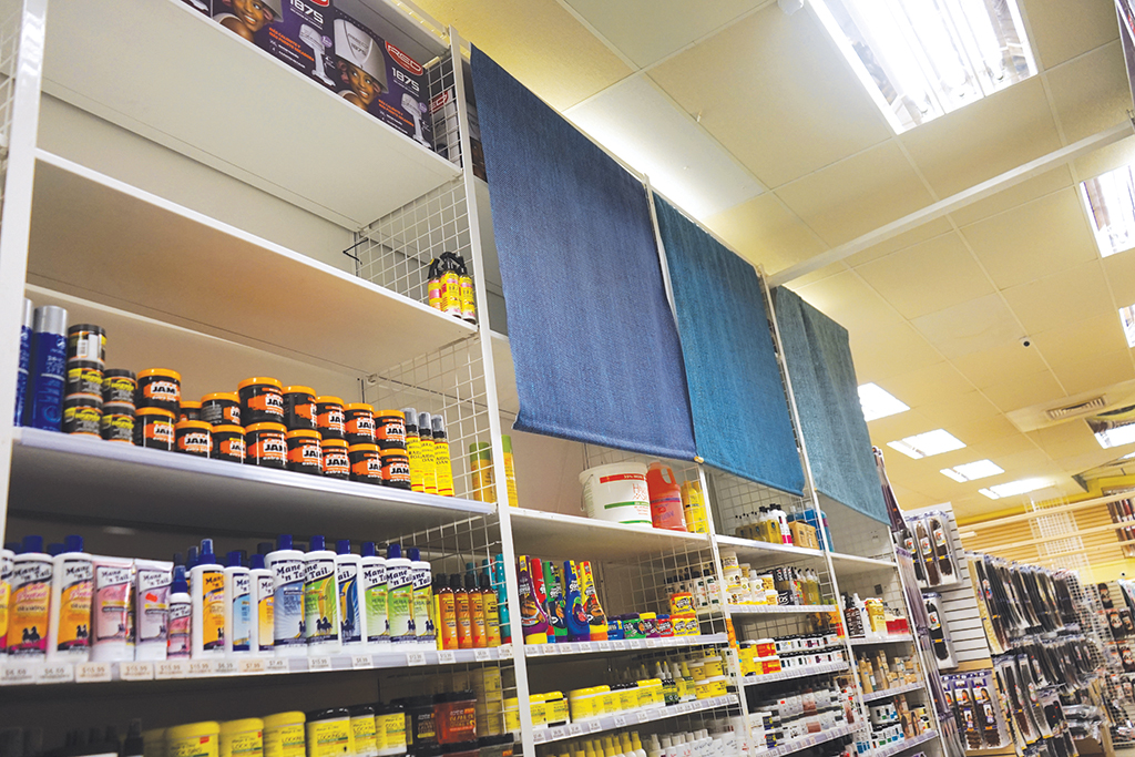
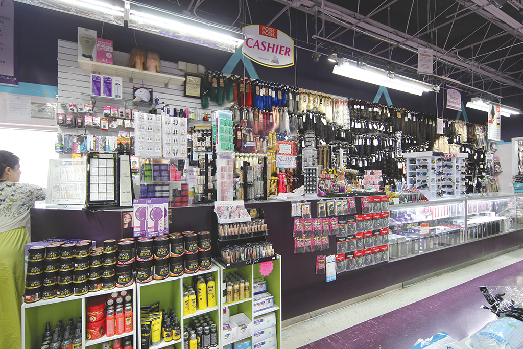
Beauty supply shelves: Big box products were placed out of the customers’ common viewing area, and inventory items were stored and covered with fabric.
 Stapls ãinvestors.com *Transformation of office supply stores: Staples, Office Depot, and other warehouse-style stores used to have four- to five-foot-high shelves that made it difficult to find items. This changed when they started to apply the “Arena Concept,” where the entire store is designed with a low midpoint and gradually rises to the point up to the maximum height within the customer’s view. Walking into a store, even if it’s a large one, you can see all of the products at a glance, dramatically reducing the number of shoppers searching for the right section and increasing the amount of time they spend in the store.
|
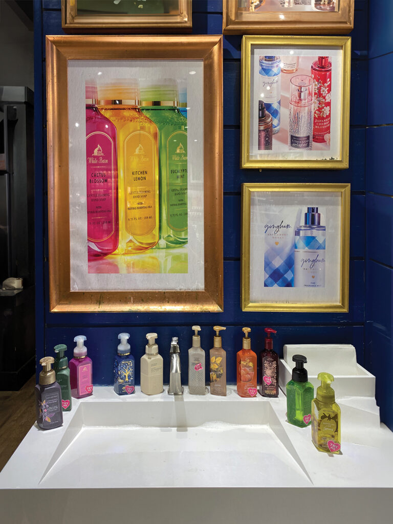
Place a matching product right next to an item on the main shelf to encourage add-on purchases. Put belts next to pants, mouse pads next to mice, dressing next to salad greens, glues and wig caps next to the wigs, and so on. Sample-sized shampoos and chemicals should be sold on the same shelf as standard-sized products, rather than having their own shelf. This is because it is what customers often look for to try out a new product.
✔︎ Test counters: shopping is an experience
Customers want to test products before buying, but merchants can’t sell products that show signs of use. The positions on offering tests or try-ons run parallel. There are retailers that prohibit wig try-ons and seal their products tightly with stickers to prevent tampering, but you’ll still find products on a corner of the shelves that have been forcefully opened and tried on. In the end, you’ve done more harm than good.
The best way to prevent package and product damage to any product is to provide ways for customers to test them freely. Customers are often only convinced after they see, hear, smell, and touch a product. Knowing this, large chain stores have made test counters widely available for customers.
There is a high probability that a try-on will lead to a purchase. Your store should create an atmosphere where customers can easily touch and try products. Keep in mind that wearing wigs and makeup requires privacy, so your product testing area should be preferably walled off or at least largely hidden from plain view.
✔︎ Checkout Zone: All’s well that ends well!
For the retail business owners, the checkout is a happy place where payment is made, but for the customers, it’s a tedious place to spend time and money enduring the mundane process. 80% of customer complaints happen in the checkout area. More than any other areas, the checkout zone requires a varied and sophisticated strategy to ensure an efficient checkout process and encourage additional purchases.
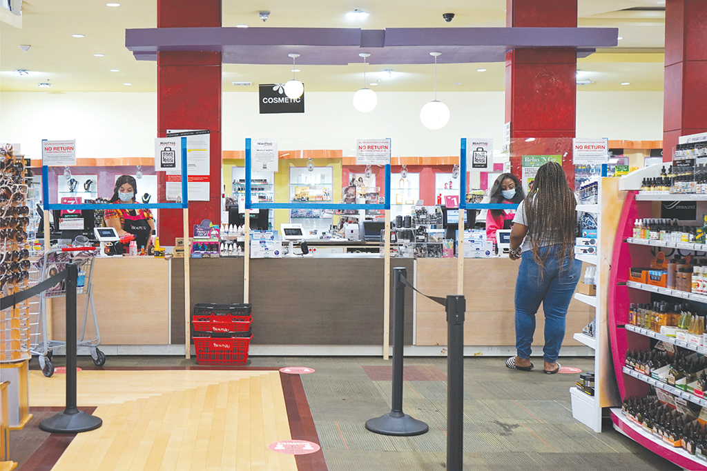
A checkout zone in a beauty supply
► Checkout location
The location of the checkout has a direct impact on the customer’s shopping flow. Experts recommend placing the checkout on the left side of the store, based on the fact that many consumers shop counterclockwise. However, in a square-shaped store, placing the counter front center may be more effective in terms of visibility and accessibility. In the end, there is no single answer for all. You should consider the situation and layout of each store. In the survey of beauty supply retailers, the location of checkout counters relative to the store entrance was 49% on the left, 44% on the right, and 7% at the center of the store.
Here are certain things to keep in mind when choosing a checkout location.
– Don’t place your checkout lanes in the first place so that customers’ eyes linger as they enter and exit. The sight of crowds waiting for checkout can be demoralizing for shoppers, and checkout lines can be a barrier to customers entering and leaving.
– A checkout counter in the middle of the store has the advantage of being accessible from all areas. However, it shouldn’t block the main walkway.
– A checkout counter in the back of the store has the advantage of freeing up product space in the front of the store, but it’s not practical for small retailers with limited staff.
– In any case, payment counters should be easy to find and accessible for everyone, and for security purposes, they should be arranged in a way that allows for proper monitoring of both customers and employees.
► Height of checkout counter
A standard checkout counter is about 34 to 36 inches high, which is considered comfortable for both cashiers and customers. In beauty supply stores, high checkout counters of 48 inches or so used to be common for ease of checkout, surveillance, and safety reasons. However, in recent years, it has gradually been lowered to around 36 inches to accommodate customer convenience. When we asked about the height of retail checkout counters, the answer of “belly button level” when viewed from the customer’s position (48%) was not significantly different from the answer of “chest level or higher” (52%).
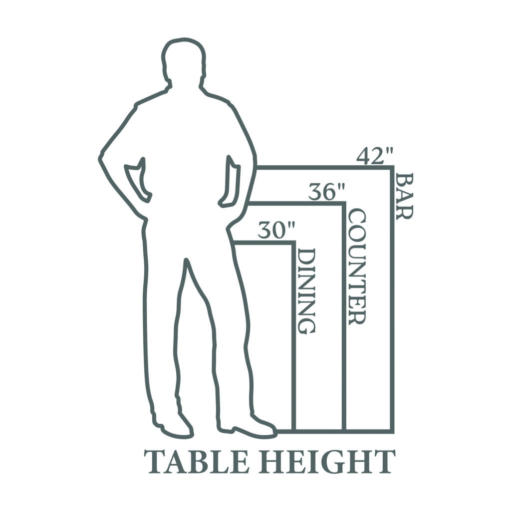
Table height ©pawleysislandhammocks
The checkout counter should allow employees to scan items, handle cash, and operate the POS machine comfortably without straining their posture. Similarly, customers should be able to place items on the counter and complete the transaction without inconvenience. The Americans with Disabilities Act(ADA) requires that at least one checkout counter in a store be 28 to 36 inches high to accommodate customers who use wheelchairs or have mobility issues. (State regulations vary. In California, the maximum is 34 inches from the floor.
► Checkout lanes
Customers may feel that shopping for 10 minutes is quite short, but waiting in line for 10 minutes is intolerable. Let’s think about how to make the “wait more enjoyable” for your customers and thereby increase sales for your store.
*impulse buy display: Display a small selection of items near the register to reduce the boredom during the wait and encourage last-minute purchases. In the survey of retailers, 36 out of 40 said they display merchandise near the checkout. In addition to accessories and jewelry (57%), small chemicals (7.4%), small oils and cosmetics, small items such as eyebrows and perfume, nail products, key chains, colored contact lenses, and so on were put near the checkout, and some stores replied their best-selling products or new products or clearance items were placed near the counter. Interestingly, a few retail businesses said they put “easy to pocket” items (products that are easily stolen) near the register. By utilizing checkout zones, the beauty supplies were tackling shoplifting.
In other industries, such as apparel and discount stores, checkout areas are often designed with multiple queues or S-shaped lane to reduce wait times and expose them to a long walk of impulse buys. It’s rare for beauty supply stores to have an S-shaped checkout lane due to space limitations, but it’s worth a try for larger stores.
Retailers display a variety of impulse buys along multiple or S-shaped lines.
*Advertising/promotional fixtures: It’s quite rare that you have the opportunity to have customers looking in the same direction in the same place. You can mount a TV on the wall behind the register or display posters and other promotional materials around the register to announce store events, new product information, and playback how to use videos. If you’re in front of a checkout line, you’re likely to be standing there for a minute and a half, so ads with long messages work well. However, the people who are first in the line don’t need to be entertained as they’re just waiting for their cue, so make sure that your merchandise displays and other items are focused on the second and following customers in line.
The checkout area is the final gateway for customers to making their purchases, and when done right, it can be the “golden zone” where you can most effectively promote your store and products and generate additional sales.